Author: Carolina Laudon
-
-
White dark
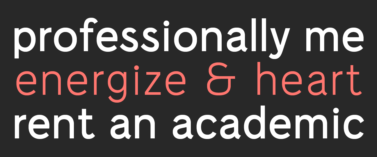
The typeface White Dark is designed as a corporate typeface for the architect company White Architects. I was given the assignment by F&B Happy who worked on their identity. The font is based on a classical neo grotesque, except that it contains no conventional characters, only the shadow of a letter. This way the character…
-
Unga Klara
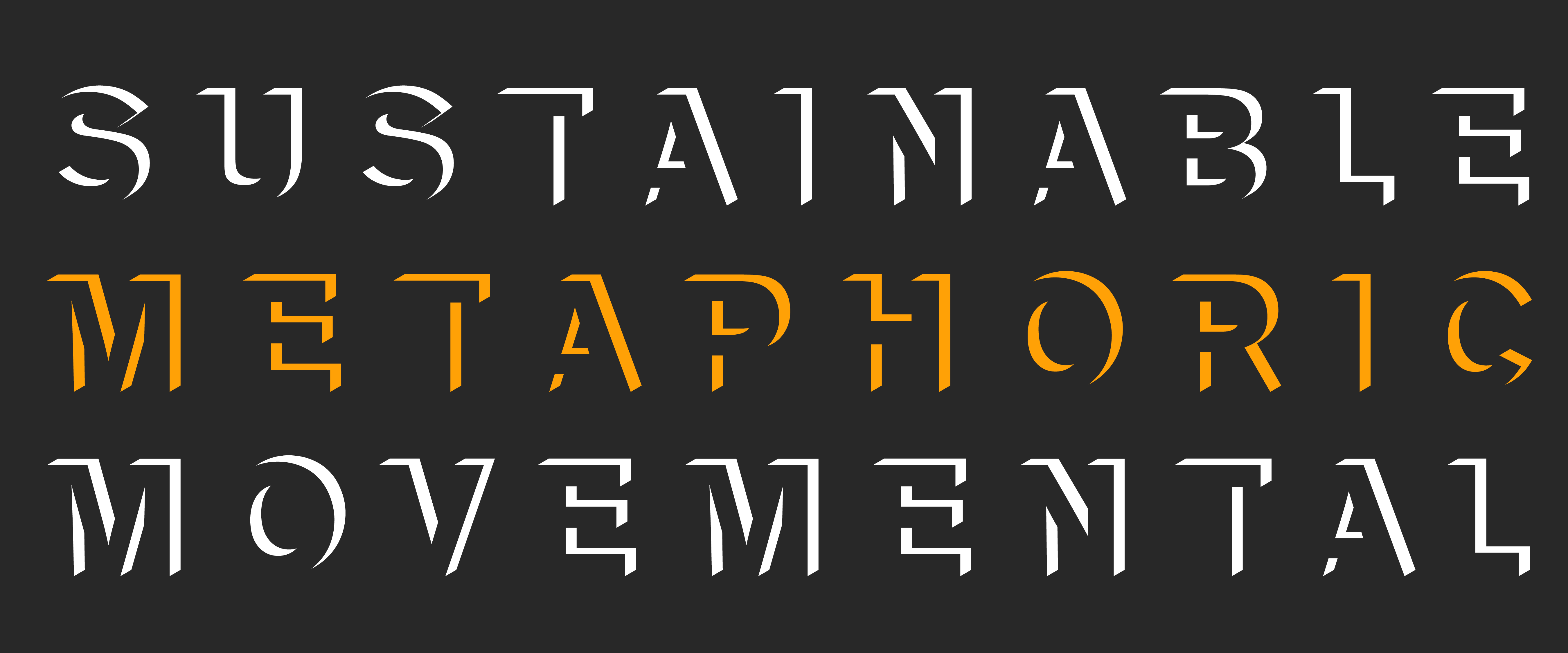
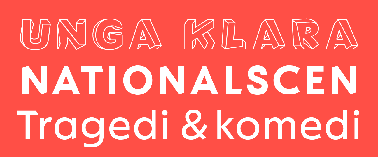
The independent theater Unga Klara, founded by Suzanne Osten in 1975, is located in Stockholm. The typeface was developed as an extension of their identity, with twisted characters that symbolize their perspective on the diversity of identities among young people. The typeface has three weights and a special edition with four different versions of the letters, that…
-
Toni Grotesk
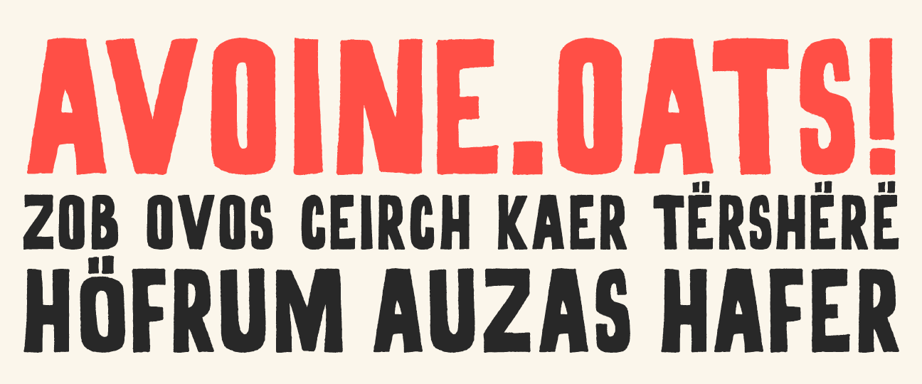
Oatly! is a Swedish company that makes products from Swedish oats. And all their products are delicious! This typeface and it’s mate John Rounded are custom designs for Oatly! and is used throughout Europe from packaging and everything in store, to all print and digital communication. In this project Lars Elfman and Christoffer Persson at…
-
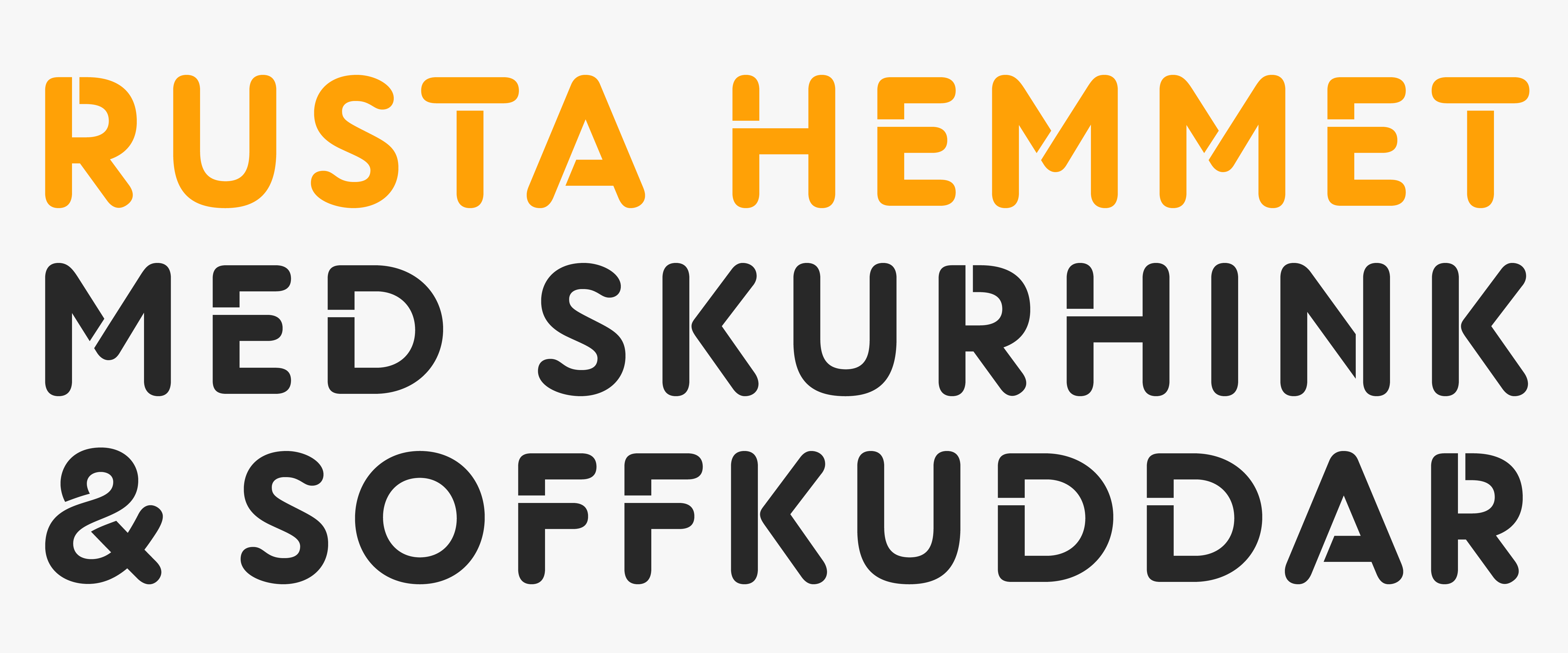
Rusta Pris
Rusta AB is one of Sweden’s largest commodity trading companies and sell a wide range of products for domestic living. Rusta has over 80 stores in Sweden and more than 10 stores in Norway and the font is used from shop signs to everything in store, from print to digital communication. The shape of the…
-
Rusta Dover
Länsförsäkringar AB is one of Sweden’s largest insurance companies. It holds pensions, house insurances and life insurances. The font is used for their logotype and for all communication from print to digital. The shapes are based on German fat face from the late 19th century. I have made all the parts of the font, both the type…
-
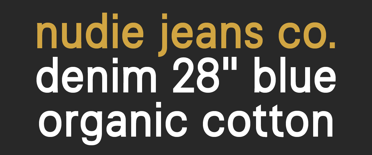
Nudie Jeans headline
Nudie Jeans Co is one of the coolest denim brands in the world, founded and located in Gothenburg. The font is used for all communication, from print to digital. The shapes are based on early 19th century industrial sans serif. In this project I worked close with the Nudie Jeans Co’s design team. I have made…
-
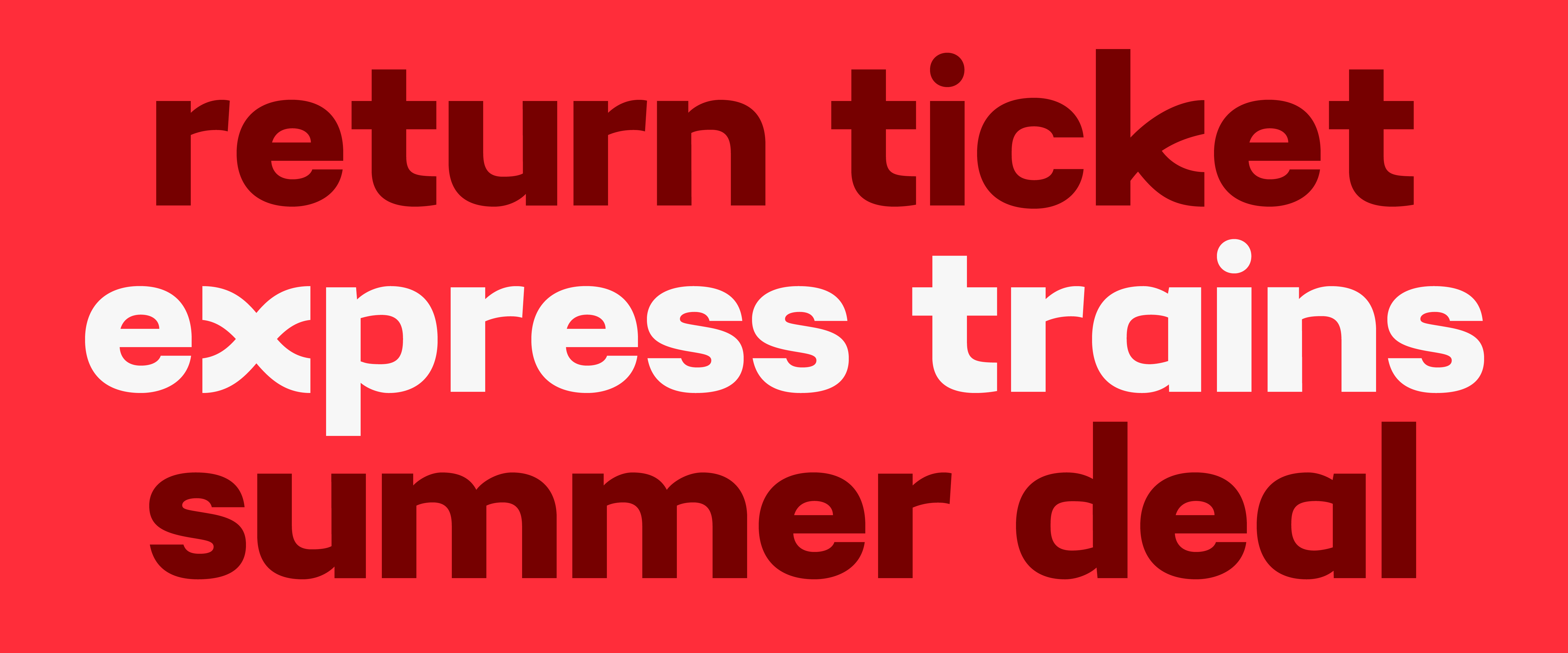
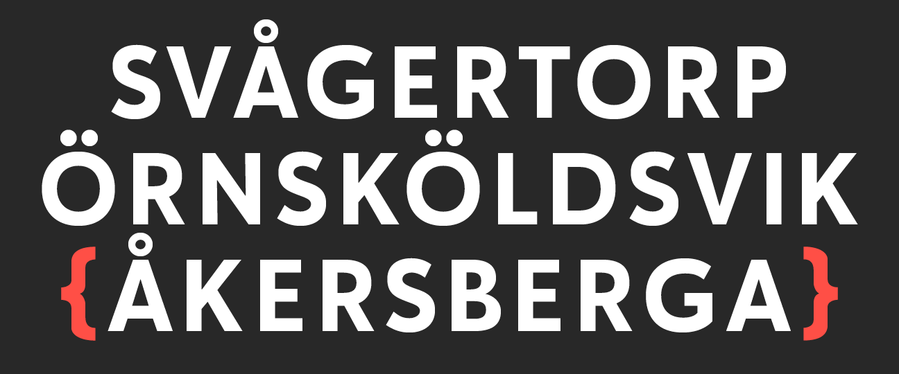
MTRX
MTRX is a Swedish company running open access intercity railway services between Gothenburg and Stockholm. The font is used for all communication from print to digital such as newsletters and website. The font strives for high recognition to communication in a business with few tracks. Therefore the font was only produced in one weight. I…
-
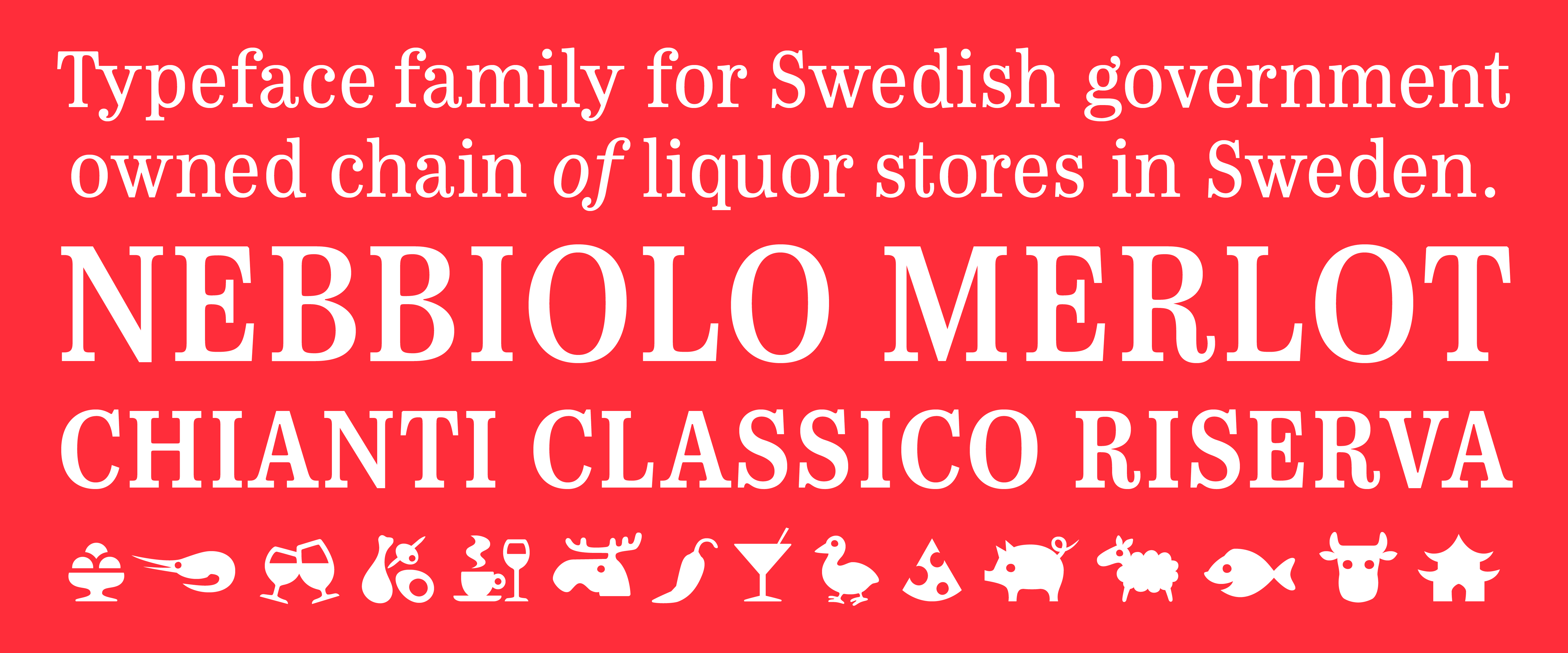
Monopol
Monopol is one of Sweden’s most public typefaces. It’s produced for Systembolaget, the Swedish stateowned alcohol monopoly, and used throughout the country from shop signs and everything in store, to all print and digital communication. The shape is based on legibility fonts from the late 19th century, originating from England, thus contemporary with the origins…