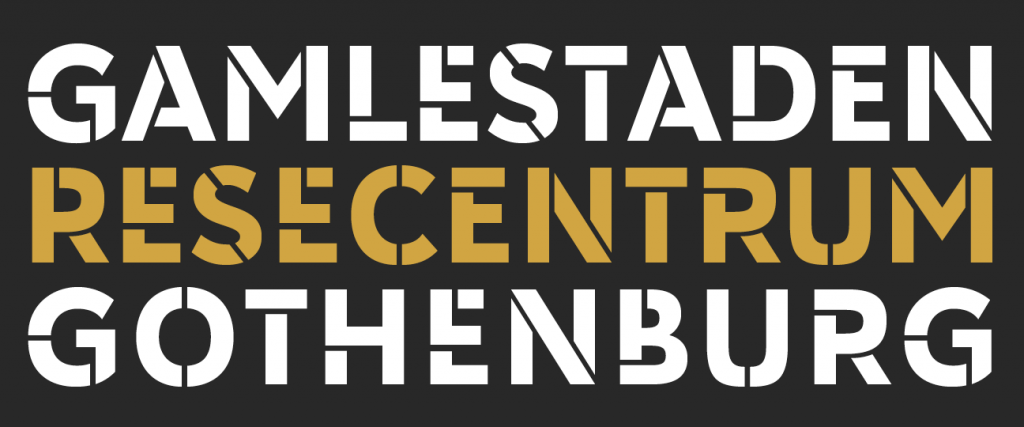
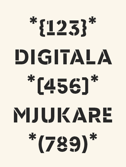
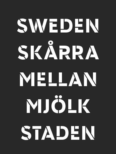
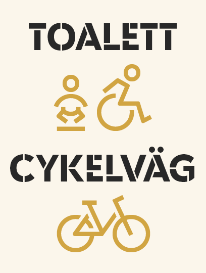
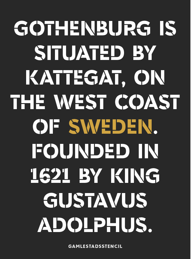
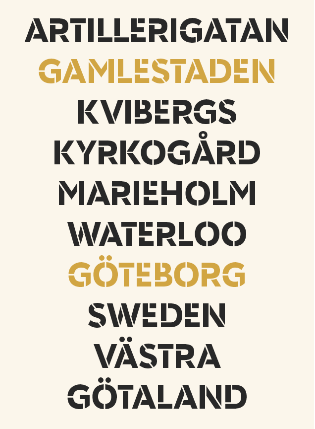
Gamlestaden is one of the larger townships in Gothenburg. The font is used for all outdoor and indoor communication and signage in a new mall and office complex. The shapes are based on German geometric sanserifs from the early 19th century. I have made all the parts of the font, both the type design, the digital font technology and web specifics.
Client : Gamlestaden / Platzer Fastigheter / Gullers Grupp
![](http://laudon.se/wp-content/uploads/2018/11/15_GS_L540_-1024x427.png)
![](http://laudon.se/wp-content/uploads/2018/11/15_GS_S540_3.png)
![](http://laudon.se/wp-content/uploads/2018/11/15_GS_S540_2.png)
![](http://laudon.se/wp-content/uploads/2018/11/15_GS_S540_.png)
![](http://laudon.se/wp-content/uploads/2018/11/15_GS_L300_2-1-1024x237.png)
![](http://laudon.se/wp-content/uploads/2018/11/15_GS_M864_2.png)
![](http://laudon.se/wp-content/uploads/2018/11/15_GS_M864_.png)