Author: Carolina Laudon
-
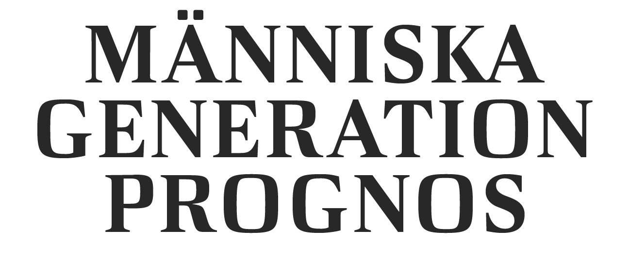
Länsförsäkringar rubrik
Länsförsäkringar AB is one of Sweden’s largest insurance companies. It holds pensions, house insurances and life insurances. The font is used for their logotype and for all communication from print to digital. The shapes are based on German fat face from the late 19th century. I have made all the parts of the font, both the type…
-
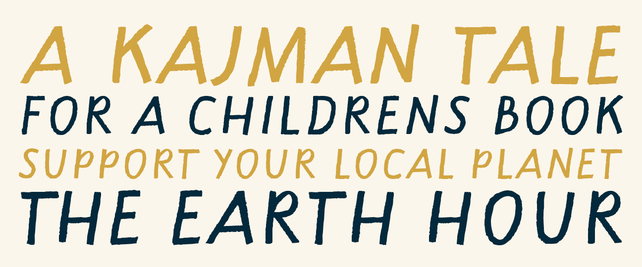
Kajman
In 2014, the recycling company Kretsloppet, together with WIMP, made a booklet for the schools in Gothenburg. The typeface Kajman is a hand-drawn script for that children’s book. The shape is based on my personal handwriting made with a carpenter’s pencil. After its use in the children’s book, it has been expanded with more characters and now…
-
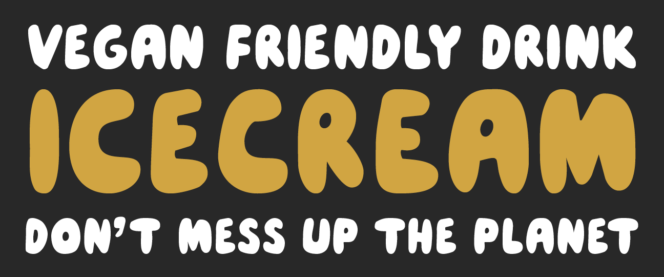
John Rounded
Oatly! is a Swedish company that makes products from Swedish oats. And all their products are delicious! This typeface and its mate Tony Grotesk are custom designs for Oatly! and is used throughout Europe from packaging and everything in store, to all print and digital communication. In this project Lars Elfman and Christoffer Persson at…
-
-
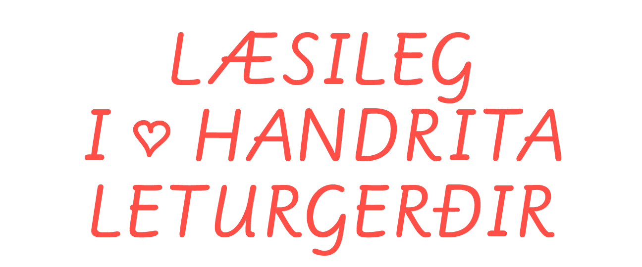
Handskrift
The font was originally commissioned by insurance company Försäkringsbolaget IF. The breif was to make a script font based on writing by an insurance sales person. I took time to study Swedish school writing and settled for Skolöverstyrelsens writing recommendations from the 1970s, on teaching writing to school children. These writing recommendations was based on…
-
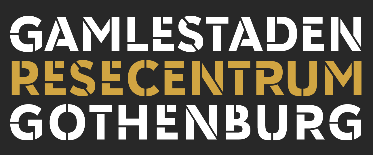
Gamlestadsstencil
Gamlestaden is one of the larger townships in Gothenburg. The font is used for all outdoor and indoor communication and signage in a new mall and office complex. The shapes are based on German geometric sanserifs from the early 19th century. I have made all the parts of the font, both the type design, the digital…
-
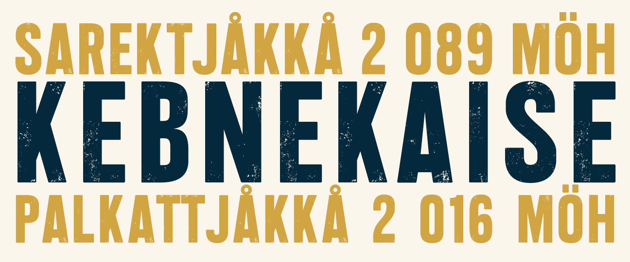
Endure
The Swedish Hunter’s Association was formed in Stockholm in 1830 by independent hunting societies. The association has an extensive cooperation with wildlife research within, and outside, the country. The typeface Endure was commissioned for The Swedish Hunters’ Association’s member magazine by Identity Works. It is based on wood types from the 1800s with an uneven…
-
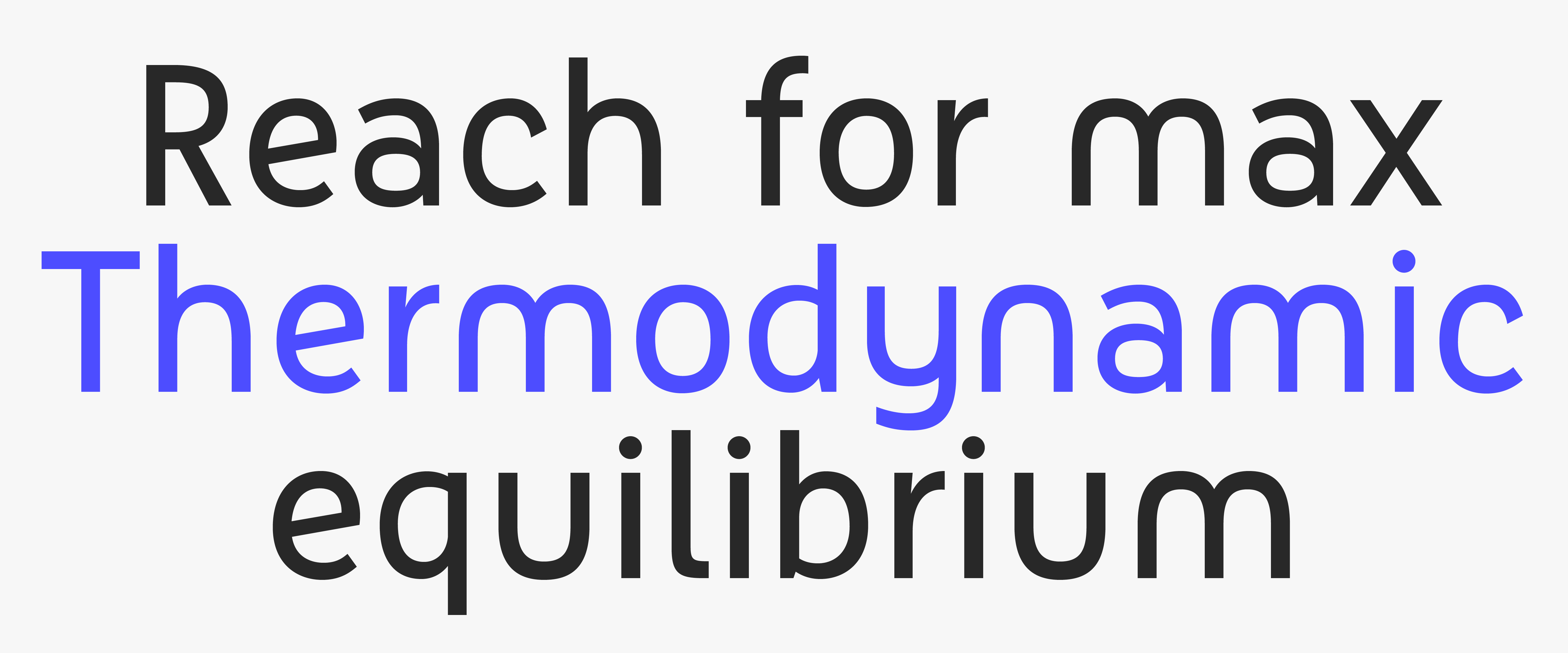
Elon
Elon AB is one of Sweden’s largest retailers in household appliances and electronic goods. They operate close to 300 stores across the country and a substantial online shop. The font is used for their logotype and for all communication from print to digital. There are three weights and one italic. The font has special numeral characters for…
-
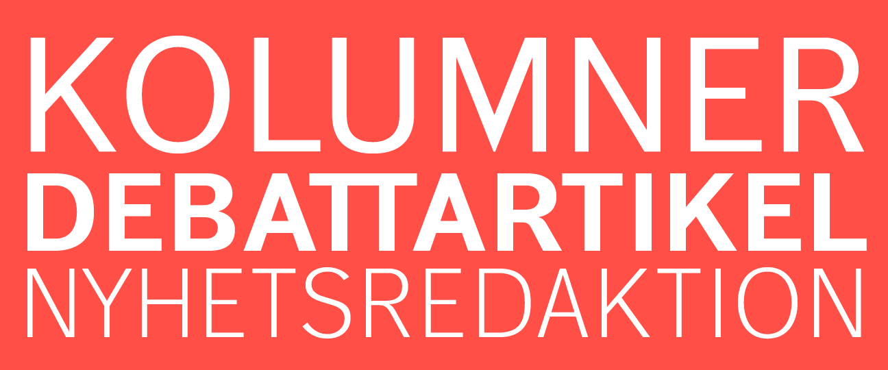
DN Grotesk
Dagens Nyheter is Sweden’s largest morning paper. The typeface DN Grotesk was a collaboration with Örjan Nordling at Pangea Design. More weights than those shown on this page was drawn out, but I was responsible for Light, Regular and Bold. This work was an assignment that I was given by Örjan Nordling following our collaboration…